
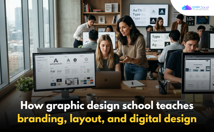
Graphic design school can turn a creative person with scattered ideas into a focused designer who knows how to build visuals with purpose.
At first, many students think design is mostly about making something look nice.
Then the first real assignment lands on the desk.
A logo looks clean, but the spacing feels off.
A poster has bold colors, but no clear message.
A website mockup looks modern, but the user has no idea where to click.
That is when design starts to feel less like decoration and more like communication.
A strong design program teaches students how to think before they create.
It shows them how branding, layout, typography, color, and digital tools work together to shape how people see a business, product, or idea.
For students who want structured creative training, a graphic design school can help build those skills step by step.
Why Design Is More Than Making Things Look Good
Good design has a job.
It guides the eye.
It builds trust.
It makes information easier to understand.
Think about the last time you picked up a menu, opened an app, or clicked on a website.
You probably made a quick judgment before reading every word.
Was it clean?
Was it confusing?
Did it feel professional?
That reaction usually comes from design choices.
A designer decides where the headline goes, how much space sits between sections, which colors feel right, and what style fits the brand.
These choices may look simple from the outside.
Inside the classroom, students learn that every choice has a reason.
Learning Branding From The Ground Up
Branding is one of the first major lessons in visual communication.
It is not just a logo.
It is the full personality of a business.
A brand can feel bold, calm, playful, luxury, local, modern, or trustworthy.
Students often begin by studying real brands they already know.
They look at packaging, websites, social media posts, colors, fonts, and messaging.
Then they ask a simple question.
Why does this brand feel the way it does?
A coffee shop may use warm colors, handwritten type, and soft photography to feel friendly and local.
A tech company may use clean lines, white space, and sharp typography to feel fast and reliable.
A children’s brand may use bright colors and rounded shapes to feel fun and safe.
Once students understand that feeling, they start building brand systems of their own.
How Students Build A Brand Identity

A brand identity project often starts with a made-up business.
Maybe it is a bakery, fitness studio, clothing brand, or mobile app.
The student must create the full visual direction.
That means choosing a logo style, color palette, font pairing, image style, and layout approach.
At first, it can feel overwhelming.
One student might choose five colors because they all look nice.
Another might pick a trendy font that looks cool but is hard to read.
That is where feedback helps.
In class, instructors and classmates point out what works and what feels disconnected.
The student revises.
The color palette gets tighter.
The logo becomes simpler.
The typography starts to match the audience.
By the end, the brand feels like one complete system instead of random pieces.
That process teaches patience, editing, and visual consistency.
Layout Teaches The Eye Where To Go
Layout is where many beginners struggle.
They may have strong images, nice colors, and good text.
Still, the design feels messy.
That usually happens because there is no visual hierarchy.
A design program teaches students how to guide the viewer’s eye.
The most important information should stand out first.
Supporting details should come next.
Extra information should not fight for attention.
Students learn to use size, spacing, alignment, contrast, and grids.
A flyer for a music event, for example, needs the event name, date, location, and call to action.
If everything is the same size, nothing feels important.
If the headline is bold, the date is clear, and the details are neatly grouped, the viewer understands the message faster.
That is the power of layout.
The Role Of Typography In Visual Design
Typography can change the mood of a design in seconds.
A sharp serif font may feel elegant.
A bold sans serif font may feel modern.
A messy handwritten font may feel personal, but it can also become hard to read.
Students learn that fonts are not just style choices.
They affect clarity.
They affect trust.
They affect how long someone stays engaged.
A simple class exercise might ask students to design the same poster three different ways using only type.
No photos.
No illustrations.
Just words, spacing, size, and alignment.
That kind of project can be frustrating at first.
Then students start to notice how much type can do on its own.
A headline can whisper.
It can shout.
It can feel serious, fun, expensive, or casual.
Once students see that, they stop treating fonts like decoration.
They start using typography as a design tool.
Color Theory Makes Design Feel Intentional
Color is emotional.
Red can feel urgent, passionate, or bold.
Blue can feel calm, professional, or dependable.
Green can feel fresh, natural, or balanced.
But color also needs control.
Too many colors can make a design feel loud.
Low contrast can make text hard to read.
A poor color choice can send the wrong message.
Students learn how to build color palettes that support the brand and improve readability.
They also study contrast, accessibility, color harmony, and visual balance.
For example, a healthcare brand may need soft, calm colors that help people feel safe.
A sports brand may need stronger colors that feel active and energetic.
A luxury brand may use fewer colors and more white space to feel refined.
These choices are not random.
They are part of the message.
Digital Design Prepares Students For Real Projects

Modern designers rarely work only on printed posters or business cards.
They also create websites, social graphics, digital ads, app screens, email layouts, and online brand assets.
That is why digital design training matters.
Students learn how to design for screens of different sizes.
They study user experience, responsive layouts, buttons, navigation, image formats, and file preparation.
A design that looks great on a large desktop screen may fall apart on a phone.
Text may become too small.
Buttons may feel cramped.
Images may load slowly.
Digital design teaches students to think about the person using the design.
Can they read it?
Can they click it?
Can they understand what to do next?
This is where creativity meets usability.
Software Skills Bring Ideas To Life
Creative ideas need the right tools.
Students often work with design software for image editing, illustration, page layout, and digital mockups.
At first, the tools can feel intimidating.
There are panels, layers, shortcuts, masks, grids, and export settings.
But over time, the software becomes less scary.
Students learn how to edit photos, create vector graphics, build layouts, adjust typography, and prepare files for web or print.
The goal is not just knowing which button to click.
The goal is knowing why to use each tool.
A clean design depends on both creative thinking and technical control.
Critiques Teach Students How To Improve
One of the most valuable parts of design education is critique.
This is where students present their work and receive feedback.
At first, critique can feel personal.
A student may spend hours on a poster, only to hear that the headline is unclear or the layout feels crowded.
But over time, critique becomes useful.
Students learn how to explain their choices.
They also learn how to listen without getting defensive.
In real design jobs, feedback is part of the process.
Clients ask for changes.
Creative directors suggest revisions.
Users respond in unexpected ways.
Classroom critique prepares students for that reality.
It teaches them how to make the work stronger.
Portfolio Projects Show Real Progress
A portfolio is more than a collection of pretty images.
It shows how a designer thinks.
It shows range, problem-solving, and attention to detail.
Students build portfolio pieces from branding projects, layout designs, digital campaigns, packaging concepts, and web mockups.
Each project tells a small story.
What was the goal?
Who was the audience?
What design choices solved the problem?
A strong portfolio helps students present their skills with confidence.
It also gives future employers or clients a clear look at what they can do.
The Real Value of Structured Design Training
Design talent matters.
But talent alone is not enough.
Students need practice, feedback, technical skills, and a process they can repeat.
That is what structured creative training provides.
It helps students move from guessing to making informed design decisions.
They learn how to build a brand identity, organize a layout, choose readable type, use color with purpose, and design for digital spaces.
Most importantly, they learn how to think like visual problem-solvers.
A blank screen becomes less intimidating.
A rough idea becomes easier to shape.
A messy first draft becomes part of the process.
That is the real lesson behind design education.
It teaches students how to turn creativity into clear, useful, professional visual communication.
Quick Search Our Blogs
Type in keywords and get instant access to related blog posts.